Mekanism
Mekanism, an independent advertising agency, had maintained its original branding since its inception in 2012. After spending two years as the lead designer, the founders and I decided it was time to give our look a fresh spin. We aimed to preserve the essence of the Mekanism spirit while modernizing digital touchpoints and infusing a touch of professionalism.
In collaboration with Tommy Means, our visionary Chief Creative Officer, I spearheaded the entire design process. This included crafting a fresh brand identity, revamping the website, and refining our social media approach.
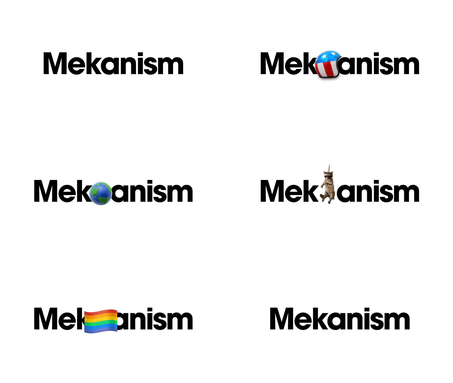
The standout feature of our rebrand is the introduction of a modular logo. This versatile element can adapt to represent client brands, internal events, holidays, and virtually anything else. I then created the brand guidelines for use agency wide.
Brand Identity
WebSite
Once we were excited about our brand identity and logo system we need to revamp how we tell our story to clients and talent. I created the wireframes and provided visual design feedback to the external digital agency.
Objects
The “mekanism” that really makes the logo system and brand id click is objects. Mekanism has a playful fun personality and a brand history studded with fun objects. We concepted these objects for brand pillars, site pages, case studies and office locations, then shot and animated them ourselves.


